Stop taking screenshots. Just point.
I wanted to comment on 10 spots on one screen. Did I really need 10 screenshots?
Set the system before the screens
Every brief is different. Where I start is not. Why colour, type and spacing become variables before I draw a single screen.
 Nabhak "Yhai" S.Product Designer at OOZOU, Bangkok
Agency work means the brief is never the same twice. Some clients send a full brand guide. Others send a logo, two colours and a feature list, then say "the rest is up to you". Cool. Cool cool cool.
What stays the same is where I start. Not with screens. With variables.
Quick translation: a variable (also called a token) is a named value like spacing/md = 16 or colour/primary. Every screen points at it. Change the value once and every screen follows.
Without them, two designers read the same brief two ways. One uses 8px gaps, one uses 10. Greys drift a shade apart. Then a developer opens the file and asks the question nobody wants: "So which value is it?"
If the client already has a system, I use it. Starting from zero, I make a couple of directions and pick the mood with the client. That part is always by hand, because it is the part I have to explain and defend. (Note 13 is all about that step.)
Once the direction is locked, it turns into variables: the brand colours spread into a palette, a neutral grey scale, a typeface, spacing and radius. From then on the whole team speaks one language.
Every component after that points at a token, never a raw number. No project is too small for this. Colour, type and spacing is already a system.
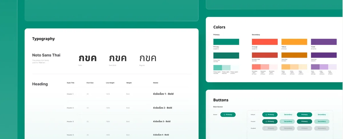
When one design has to serve more than one brand, Figma Variables earns its keep. One collection, one mode per brand. The components stay the same, you switch the mode and the whole page changes.
Light and dark mode work the same way. It is also why "can we try another primary colour?" stops being a scary message.
Button/Primary/Large/WithIcon, never Button v2 final.I would rather add a variant later than look after twenty that nobody touches.
Email me, or follow on LinkedIn where new notes land first. No newsletter, no pop-up, promise.